Visualization
Contents
1.3. Visualization
Data visualization is an essential tool for discovering and communicating insights in a simple, actionable way. Data science is problem-driven, and one of the easiest ways to quickly understand the problem at hand is to visualize the relevant data. Although data visualization may seem less rigorous or scientific than the other statistical methods described in this note, visualizations often uncover important insights not captured in quantitative data summaries.
Additionally, data visualizations allow managers and business analysts to communicate important information across large organizations. The old phrase “a picture is worth a thousand words” applies well – in business contexts, visualizations are often one of the best ways to communicate essential information quickly and effectively. For example, one study of e-commerce firms found a four to ten percent increase in weekly revenues after the adoption of an analytics dashboard. Creative uses of color, shapes, and even animation can succinctly tell a compelling story. Interactive dashboards allow stakeholders to track key business metrics in real-time. As a manager, all of these tools can help you and your team stay informed about different outcomes.
Each problem is different and calls for a unique approach when it comes to visualizing the relevant data. However, the following general principles can help produce effective visualizations.
Make sure your visualization is driven by a clear, well-formulated business question. Avoid visualization for its own sake.
Be honest. Visualizing data inaccurately can constitute a breach of trust between you and your audience.
Focus on storytelling. Your visualization should be compelling and inspire action among stakeholders.
Less is often more. A simple visualization that communicates one insight effectively is better than a complicated visualization that communicates multiple insights poorly.
Use the right color palette. If your visualization features multiple colors, you want those colors to be distinct. Most of the modern software tools for data visualization come with a recommended set of color palettes.
Avoid color combinations that affect people with color blindness (red v. green, green v. brown, etc.)
1.3.1. Quantitative Variables
In this section, we will review some of the data visualizations that are appropriate for quantitative variables.
1.3.1.1. Histograms
Often one of the best ways to get a quick understanding of your data is to visualize it in a few basic charts. The simplest of these is a histogram, which shows how a variable is distributed over a range of values. The range of values on the x-axis is divided into “buckets.” The height of each bucket in a histogram represents the number of observations that fall within that bucket’s range. We can create a histogram in R with the hist() function.
Syntax
hist(x)
Required arguments
x: The atomic vector of values.
hist(employees$Salary)
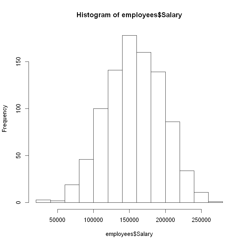
From this figure, we can see that the salary data is centered at a mean of around $150,000, and that the majority of the observations fall between $100,000 and $200,000.
1.3.1.2. Boxplots
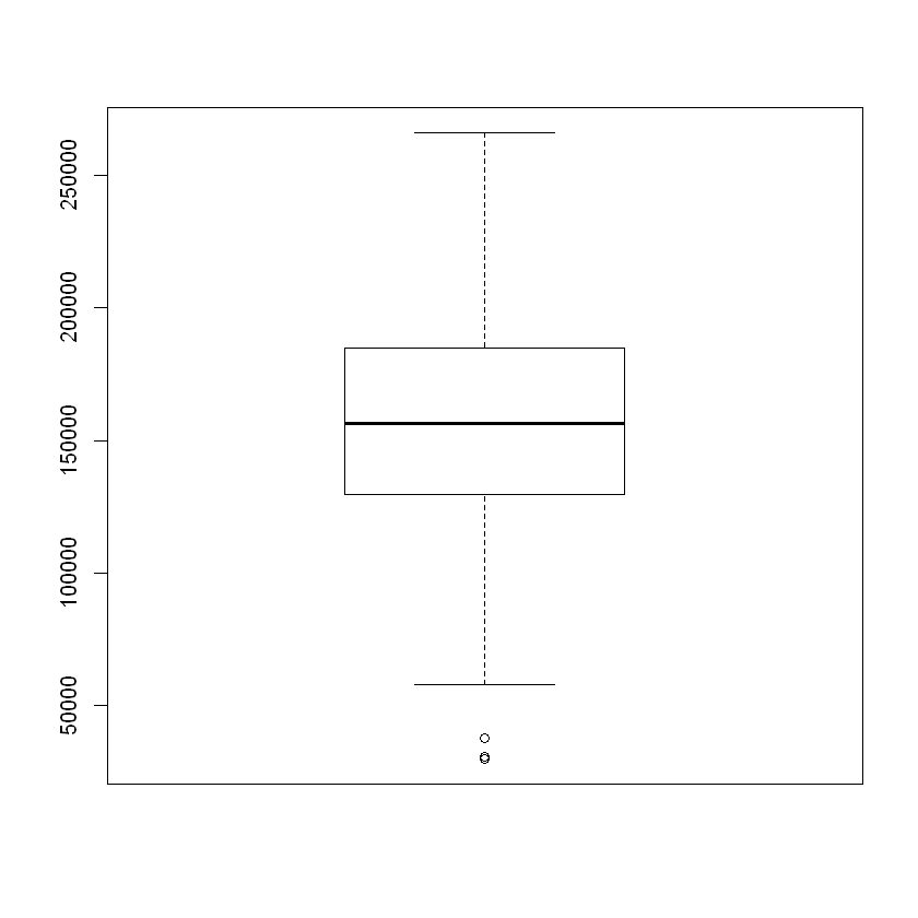
Another very useful chart is the boxplot, which is an alternative way to visualize the distribution and spread of a variable. The boxplot serves as a visual display of five main values:
The median (i.e., the 50th percentile) of the data, represented by the middle line of the box.
The 25th and 75th percentiles of the data, represented by the sides of the box (Q1 and Q3 respectively).
The Interquartile Range (IQR) is the distance between the 25th and 75th percentiles, that is:
IQR = Q3 - Q1
The minimum and maximum values form the ends of the boxplot’s “whiskers”. Note that these points are actually not the smallest and largest values in the data set. Instead, these two points are calculated as follows:
“minimum” = Q1 - 1.5 * IQR
“maximum” = Q3 + 1.5 * IQR
In R, any points that fall to the left of (i.e., less than) the minimum or to the right of (i.e., greater than) the maximum are plotted individually and treated as outliers. See the section Outliers for an extended discussion of outlier detection.

Fig. 1.1 Boxplot
We can create a boxplot in R with the boxplot() function.
Syntax
boxplot(x)
Required arguments
x: The atomic vector of values.
boxplot(employees$Salary)
1.3.1.3. Side-by-Side Box Plots
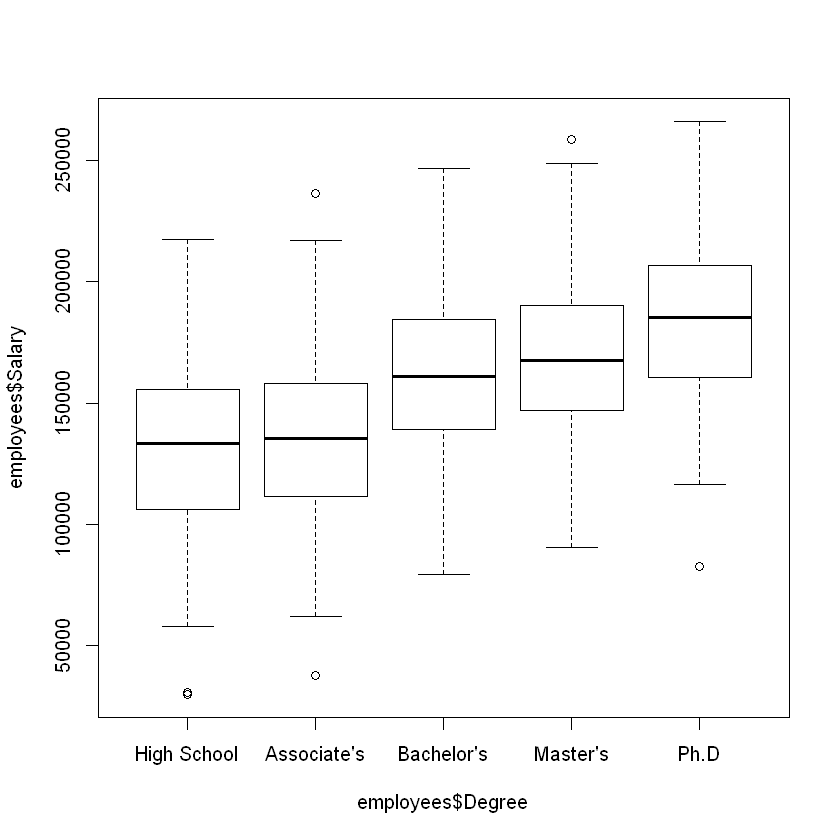
Side-by-side boxplots can be used to visualize the distribution of a quantitative variable over each value of a categorical variable. For example, imagine we wanted to compare the distribution of yearly income of employees at a software company (a quantitative variable) over the highest attained degree of the employees (a categorical variable). The code below creates a box plot of the Salary variable for each value of Degree in employees. Note that the boxplot() function uses the tilde (~) notation; the quantitative variable we’re analyzing goes before the tilde, and the categorical variable comes after.
boxplot(employees$Salary ~ employees$Degree)
1.3.1.4. Scatter Plots
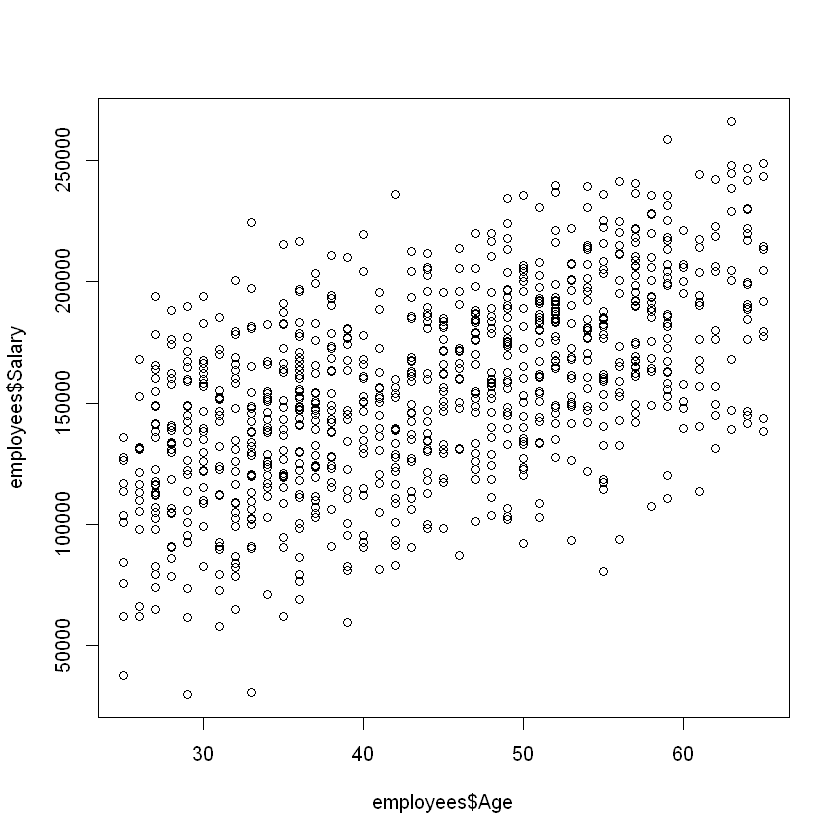
Scatter plots can be used to get a quick feel for how two quantitative variables are related. The figure below uses a scatter plot to depict the relationship between the salary and age of the employees at a software company. From this figure, we can see that there is a moderate, positive relationship between age and salary.
The plot() function takes two variables as inputs; the first variable is plotted on the x-axis, and the second variable is plotted on the y-axis.
Syntax
plot(x, y)
Required arguments
x&y: The atomic vectors of values.
plot(employees$Age, employees$Salary)
From this figure, we can see that all five groups have roughly the same variance (spread), but that the median salary increases for each degree.
1.3.2. Categorical Variables
In this section, we will review some of the data visualizations that are appropriate for quantitative variables.
1.3.2.1. Bar Plots
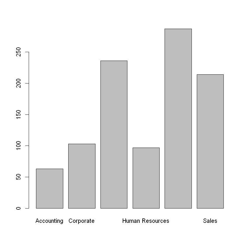
For categorical variables, bar plots can be used to visualize how the data are distributed over the different categories. Specifically, a bar plot shows the number of observations corresponding to each category of a categorical variable, such as Division. The bar plot below visualizes the number of employees in each division of a software company. From this figure, we can see that the operations, engineering, and sales departments are the largest, while the accounting, corporate, and human resources departments are smaller.
To create the barplot, we first need to create a table of the categorical variable we are examining, then apply barplot() to that table.
Syntax
barplot(table(x))
Required arguments
x: The atomic vector of values.
barplot(table(employees$Division))
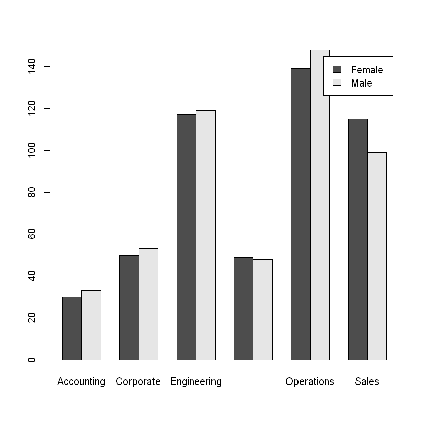
If we want to visualize the relationship between two categorical variables, we can do so with a side-by-side bar plot. The figure below depicts the distribution of gender across the divisions of the company. From this figure, we can see that there does not seem to be any major differences in gender within each department, except possibly sales and operations. To explore this question rigorously, we need statistical inference (described in Testing Proportions).
To create the side-by-side bar plot, we apply the barplot() function to a two-way table and set the optional beside parameter equal to TRUE. Note that we also set legend = TRUE so that a legend is added to the plot.
barplot(table(employees$Gender, employees$Division), beside = TRUE, legend = TRUE)
1.3.2.2. Pie Chart
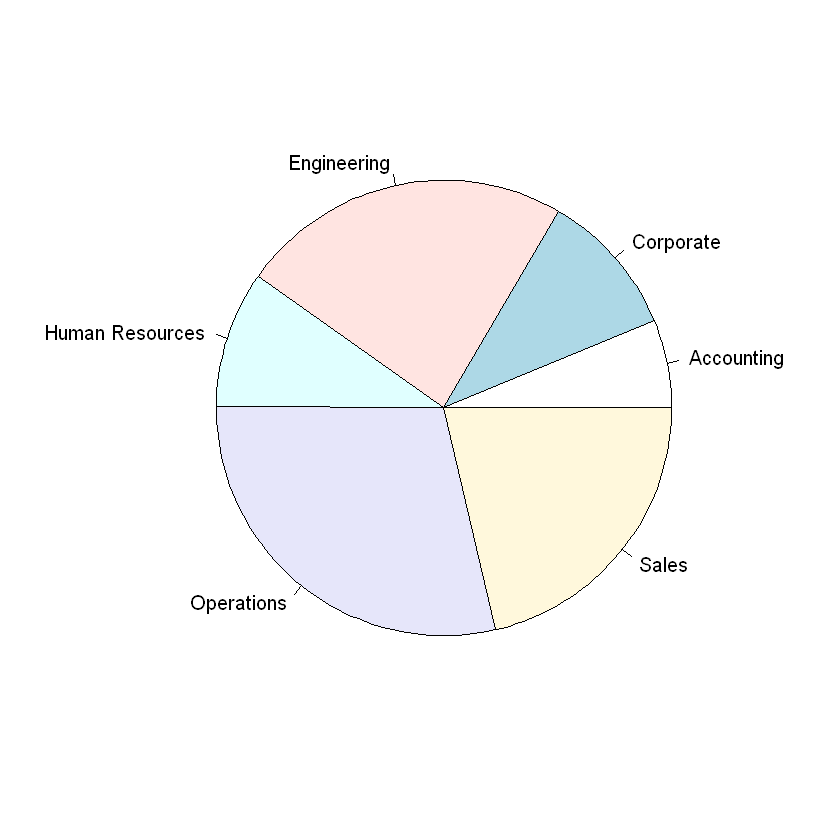
Finally, a pie chart can be used to depict the proportion of observations corresponding to each value of a categorical variable. The pie chart below visualizes the proportion of employees in each division of a software company. We can create a pie chart in R with the pie() function.
Syntax
pie(table(x))
Required arguments
x: The atomic vector of values.
pie(table(employees$Division))
