5.1. Correlation
Do students learn better when they get more sleep?
How much should a car lease charge per mile used?
Questions such as these relate two continuous variables and ask whether there is a linear association between them. Scatter plots are the ideal way to picture such associations, but how does one rigorously summarize an association between two variables? To explore this question, we will return to the employees data set. As a reminder, this data set has data on 1,000 employees at a software company, including their income, age, gender and job function. Below we show the first few observations of this data.
head(employees)
| ID | Name | Gender | Age | Rating | Degree | Start_Date | Retired | Division | Salary |
|---|---|---|---|---|---|---|---|---|---|
| 6881 | al-Rahimi, Tayyiba | Female | 51 | 10 | High School | 1990-02-23 | FALSE | Operations | 108804 |
| 2671 | Lewis, Austin | Male | 34 | 4 | Ph.D | 2007-02-23 | FALSE | Engineering | 182343 |
| 8925 | el-Jaffer, Manaal | Female | 50 | 10 | Master's | 1991-02-23 | FALSE | Engineering | 206770 |
| 2769 | Soto, Michael | Male | 52 | 10 | High School | 1987-02-23 | FALSE | Sales | 183407 |
| 2658 | al-Ebrahimi, Mamoon | Male | 55 | 8 | Ph.D | 1985-02-23 | FALSE | Corporate | 236240 |
| 1933 | Medina, Brandy | Female | 62 | 7 | Associate's | 1979-02-23 | TRUE | Sales | NA |
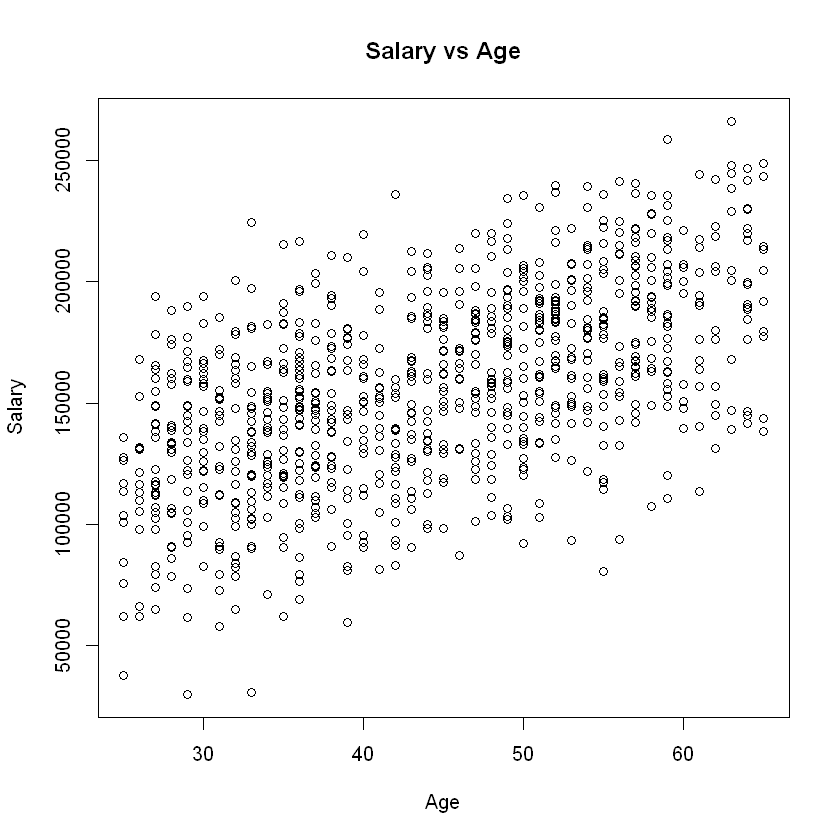
Now let’s create a scatter plot depicting the relationship between annual income and age in years:
plot(employees$Age, employees$Salary,
        main="Salary vs Age",
        xlab="Age",
        ylab="Salary")

We would describe this plot as showing a “moderate, positive relationship” between income and employee age. The strength of this relationship can be summarized by a statistical measure called the correlation coefficient, or simply the correlation.
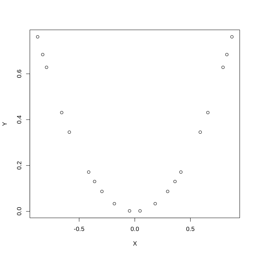
The correlation, denoted \(r\), is a value between -1 and 1 and measures the direction and strength of a linear relationship between two variables. In short, how well would a line fit our observed data? If the correlation is positive, then on average as one variable rises the other variable rises (and vice versa). If the correlation is negative, then on average as one variable rises the other variable falls. Keep in mind that correlation is a measure of linear relationship. Thus, a correlation of zero means that there is no linear relationship between two variables, but there could be a non-linear relationship. For example, in the chart below, \(X\) and \(Y\) are clearly related, but not in a linear fashion. Indeed, the correlation between \(X\) and \(Y\) in the graph below is zero.

Fig. 5.1 Correlation of a Non-Linear Relationship
A rough rule of thumb table for how to interpret the correlation in absolute value |\(r\)| is as follows:
|\(r\)| |
Interpretation |
|---|---|
0 - 0.2 |
Very weak |
0.2 - 0.4 |
Weak to moderate |
0.4 - 0.6 |
Medium to substantial |
0.6-0.8 |
Very strong |
0.8-1.0 |
Extremely strong |
In R, we can compute correlation using the command cor():
Syntax
cor(x, y, use = "everything")
Required arguments
x: A numeric vector that represents the \(X\) variable.y: A numeric vector that represents the \(Y\) variable.
Optional arguments
use: Ifuseequals"everything", all observations are used to calculate the correlation. Ifuseequals"complete.obs", only the observations that complete (i.e., that are not missing values for either variable) are used.
For example, we can use cor() to calculate the correlation between Salary and Age in the employees data. Note that we set use = "complete.obs" because Salary is missing for some of the observations in the data set.
cor(employees$Age, employees$Salary, use = "complete.obs")
[1] 0.5635125
The R command cor.test() returns the correlation between two variables, as well as a 95% confidence interval for the population correlation. It also returns the p-value of a hypothesis where the null and alternative hypotheses are:
\(H_o\): \(r = 0\) (the population correlation equals zero)
\(H_a\): \(r \ne 0\) (the population correlation does not equal zero)
The cor.test() function uses the following syntax:
Syntax
cor.test(x, y, alternative = "two.sided")
Required arguments
x: A numeric vector that represents the \(X\) variable.y: A numeric vector that represents the \(Y\) variable.
Optional arguments
use: Ifalternativeequals"two.sided, the alternative hypothesis is \(r \ne 0\). Ifalternativeequals"less, the alternative hypothesis is \(r \le 0\). Ifalternativeequals"greater, the alternative hypothesis is \(r \ge 0\).
cor.test(employees$Age, employees$Salary)
	Pearson's product-moment correlation

data:  employees$Age and employees$Salary
t = 20.668, df = 918, p-value < 2.2e-16
alternative hypothesis: true correlation is not equal to 0
95 percent confidence interval:
 0.5177359 0.6060718
sample estimates:
      cor
0.5635125
Based on our sample of data, the correlation between Salary and Age is 0.56, indicating a moderately strong linear relationship between the two variables. One must remember that this correlation estimate of 0.56 is a point estimate and should not be interpreted as the true correlation between the two variables of interest. This is because 0.56 is simply an estimate calculated from the sample data. If we were to draw a different sample, the resulting estimate would almost certainly be different. However, although we cannot calculate the true correlation from the sample data, we can calculate a range of vales (called a confidence interval) where we believe the true population correlation lies. Based on our sample of data, the 95% confidence interval for the population correlation is (0.52, 0.61). This means we are 95% confident the true population correlation is between 0.52 and 0.61. Note that if zero were in this interval, we would not be able to conclude that there is a linear relationship between the two variables.
5.1.1. Correlation is Not Causation
Although the correlation coefficient measures the strength of a linear relationship between two variables, it provides no information about cause or effect. A high correlation may imply that two variables move in tandem, but it does not imply that one causes the other. For example, there is a high correlation between the number of firefighters at a fire and the dollar amount of the resulting damage. However, this does not mean that firefighters cause damage. In this case there is a third variable (called a confounding variable) - the size of the fire. The confounding variable is causally related to the other two variables; a larger fire causes more damage and causes more firefighters to show up. One must always consider whether an observed correlation can be explained by a confounding variable.
Warning
Correlation does not imply causation.
5.1.2. The Correlation Matrix
If we have several variables we can create a correlation matrix, which shows us all the possible correlations at once. As an example, the following R code will create a correlation matrix between the Age, Rating, and Salary variables in the employees data. Note that this is the same cor() command that we saw above; instead of passing in two numeric vectors x and y, we can pass in a data frame and cor() will calculate the correlation between all of the variables in the data frame.
cor(employees[,c("Age", "Rating", "Salary")], use = "complete.obs")
| Age | Rating | Salary | |
|---|---|---|---|
| Age | 1.00000000 | 0.06199581 | 0.5635125 |
| Rating | 0.06199581 | 1.00000000 | 0.3064684 |
| Salary | 0.56351248 | 0.30646840 | 1.0000000 |
From the results, we learn, for example, that the correlation between Salary and Rating is 0.3065. The matrix is symmetric, meaning that the correlation between Salary and Rating is the same as the correlation between Rating and Salary. The diagonal of this matrix is all ones, indicating that the correlation of a variable with itself is one.
