5.3. Understanding Our Regression Model¶
Our least squares estimates \(b_0\) and \(b_1\) are estimates of the true theoretical values \(\beta_0\) and \(\beta_1\) respectively. Since the regression line is calculated using sample data, we can construct confidence intervals and perform hypothesis tests on our estimates. The confint() function reports 95% confidence intervals for the regression coefficients.
Syntax
confint(model)
confint(modelAge)
| 2.5 % | 97.5 % | |
|---|---|---|
| (Intercept) | 58390.197 | 75877.208 |
| Age | 1834.364 | 2219.292 |
We can obtain more detailed output using the summary() command.
Syntax
summary(model)
summary(modelAge)
Call:
lm(formula = Salary ~ Age, data = employees)

Residuals:
    Min      1Q  Median      3Q     Max
-103272  -21766    2428   23138   90680

Coefficients:
            Estimate Std. Error t value Pr(>|t|)
(Intercept) 67133.70    4455.17   15.07   <2e-16 ***
Age          2026.83      98.07   20.67   <2e-16 ***
---
Signif. codes:  0 '***' 0.001 '**' 0.01 '*' 0.05 '.' 0.1 ' ' 1

Residual standard error: 32630 on 918 degrees of freedom
  (80 observations deleted due to missingness)
Multiple R-squared:  0.3175,	Adjusted R-squared:  0.3168
F-statistic: 427.1 on 1 and 918 DF,  p-value: < 2.2e-16
Our guess for \(\beta_1\) is $2,026.83, but because we are basing this estimate on a data sample, we could be wrong. We can say with 95% confidence that the true value of the slope (denoted \(\beta_1\)) is between $1,834.36 and $2,219.29. The good news is the confidence interval is all positive, indicating a positive relationship between Salary and Age. If zero were in this interval we would not be able to conclude that there was a positive relationship between Salary and Age.
By applying the summary() command to our regression we can see p-values listed for each coefficient. The hypothesis test being done here is “does the true slope equal 0?”, and “does the true intercept equal 0?”. In symbols we are testing for the slope:
\(H_o: \beta_1 = 0\)
\(H_a: \beta_1 \ne 0\)
A small p-value (typically below 0.05) means we reject the null hypothesis and can conclude there is likely a linear relationship between the \(X\) and \(Y\) variables; simply put, a small p-value indicates we need \(X\) in the model.
The p-value for the intercept corresponds to the hypothesis test asking, “does the true intercept equal 0?” We often ignore the p-value of the intercept when the intercept is difficult to interpret.
5.3.1. The R-Squared (\(R^2\))¶
From our regression summary we can also see the multiple R-squared (denoted \(R^2\)) and the adjusted R-squared (denoted \(R_a^2\)). \(R^2\) is a goodness-of-fit measure and always falls in the interval 0 to 1. In essence, we do regression to try to understand how changes in the \(X\) variable explain what is happening to a \(Y\) variable. If \(Y\) didn’t vary when \(X\) changes, it would be very boring to explain, so in essence we are trying to explain the variation in \(Y\) using \(X\). The \(R^2\) tells us the percentage of the variation in \(Y\) explained by \(X\), with higher being better. In our regression of Salary against Age, the \(R^2\) equals 0.3175; from this we conclude that “in our model, 31.75% of the variation in income is explained by age.”
One issue with \(R^2\) is that it can go up simply by adding more \(X\) variables to a model, so \(R_a^2\) has a penalty factor related to the number of \(X\) variables in the model. The adjusted R-squared, which in our example equals 0.3168, is always preferable to report of these two measures. However, neither \(R^2\) nor \(R_a^2\) indicates anything about predictability, so another measure described below is more useful to consider.
Warning
When a linear regression model has more than one independent variable, report \(R_a^2\) instead of \(R^2\).
5.3.2. Estimate of Noise and Prediction¶
When we look at the scatter plot with our regression model, we see noise in the model, that is, we see a line plus variation (noise) around the line. Regression modeling assumes that the noise \(\epsilon\) is normally distributed with mean 0 and variance \(\sigma^2\). The value \(\sigma^2\) is key when using a regression model for prediction, since it tells us how accurate our predictions are. The estimate of \(\sigma\) from our sample data is denoted \(s_e\) and is called the residual standard error.
This residual standard error is important because approximate 95% prediction intervals can be found using the formula:
To understand this, let’s examine \(s_e\) from the regression, which equals $32,630. The predicted salary of someone 40 years old is approximately: $\(\$67,133.70 + \$2,026.83(40) = \$148,206.9.\)$
But we know it is not an exact relationship, so it would be nice to put lower and upper bounds on this prediction. Using \(s_e\), we can say we are roughly 95% confident that the predicted salary for someone 40 years old is in the interval:
A more formal prediction interval can be found in R using the predict() function. Note that the formula shown above is an approximation and that this function’s results are more precise, so the intervals differ slightly.
newData <- data.frame(Age = 40)
predict(modelAge, newData, interval = "predict")
| fit | lwr | upr |
|---|---|---|
| 148206.8 | 84124.55 | 212289.1 |
A rough rule of thumb when looking at regression models is to look at \(s_e\) then double it; your 95% prediction interval will be roughly \(\hat{y} \pm 2(s_e)\) (for this estimate 2 is rounded up from 1.96). You can use this as a quick guide to decide if you think your model is acceptable.
Warning
\(R^2\) does not inform about a linear regression model’s predictive ability, so one must also report \(s_e\).
5.3.3. (§) Basic Diagnostic Plots¶
Note
This section is optional, and will not be covered in the DSM course. For the assigned reading move on to the next section, 5.4. Multiple Linear Regression.
When doing regression analysis, we assume a linear relationship between the \(X\) and \(Y\) variable. We also assume the noise in the model follows a normal distribution. Both of these assumptions may be checked with separate diagnostic plots.
The residuals \(e_i\), also called the errors, are the observed (\(y_i\)) minus the predicted (\(\hat{y_i}\)) values for each row in our data set. The most basic plot is a residual versus fitted (predicted) value plot. This plot is easily created in R as shown below, and if the modeling assumptions are correct should show a random scatter of points. Note that we pass our regression model into the same plot() function we have seen before, but set the which argument to 1 in order to get a residual vs. fitted plot.
plot(modelAge, which=1)
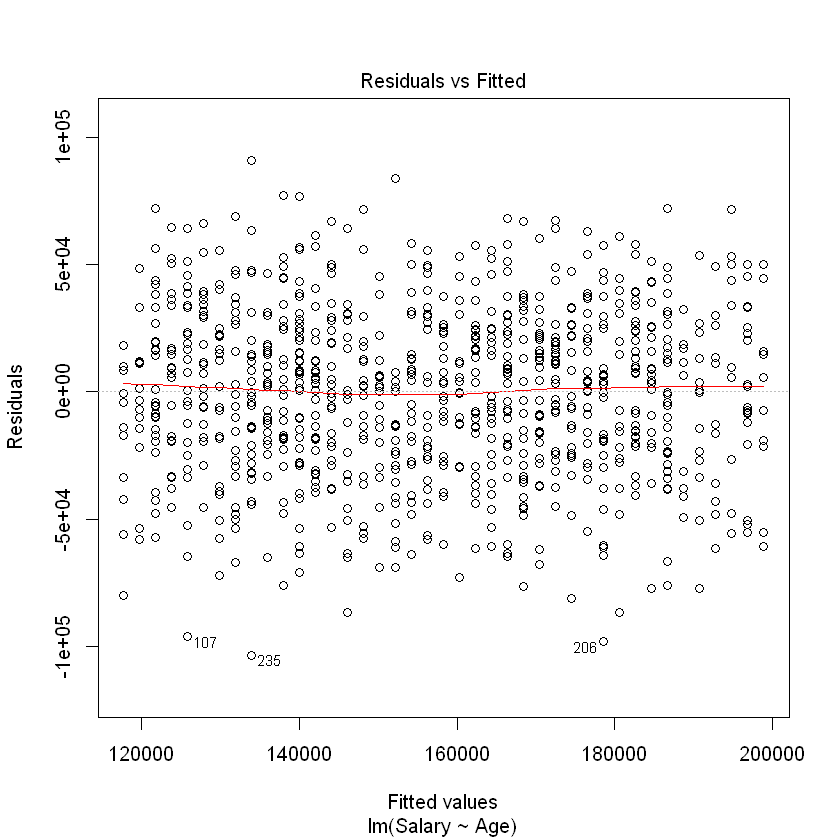
The red line shown in the plot is a local linear smooth used to capture the trend of the points. We see no relationship between the residuals and the fitted values, which must be true if the regression assumptions hold.
To contrast with the ideal plot, consider some simulated data of a non-linear relationship between \(X\) and \(Y\), which we don’t know so we fit a line. As the plots below indicate, there is an unusual relationship between the residuals and fitted values that would indicate we should investigate this model more fully.
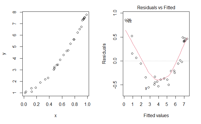
Fig. 5.3 Unusual Residuals v. Fitted Plot¶
The normality assumption of the noise in the model may be checked by either looking at a histogram or a qq-plot of the error terms. We can extract an atomic vector of the residuals from our model using the residuals() function:
Syntax
residuals(model)
By passing these residuals into hist(), we can observe the histogram of the residuals to check whether they are normally-distributed:
hist(residuals(modelAge))
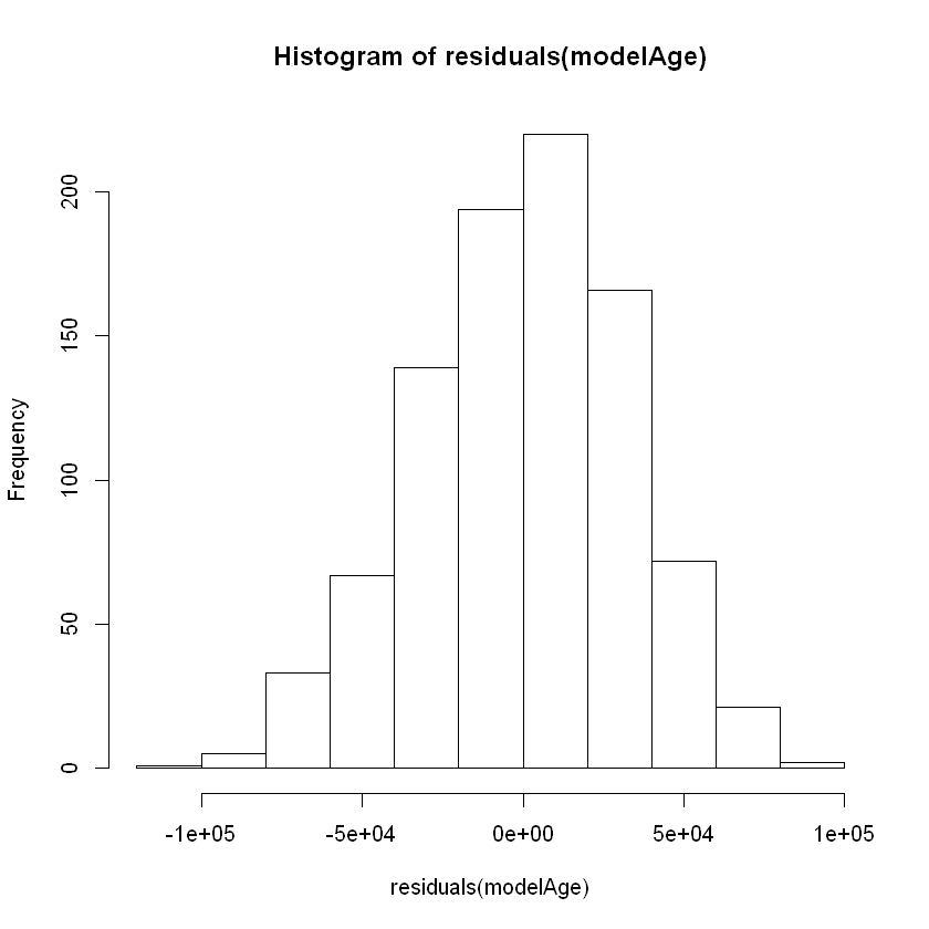
Based on this plot, the residuals of our model appear to be relatively normal. Another important diagnostic plot to look at is the qq-plot, which also helps us visually inspect whether our residuals are normally distributed. A qq-plot plots the residuals from our model against a straight line. If the plotted residuals fall mostly on the straight line, we conclude that they are most likely normally-distributed. If they deviate from the straight line, we conclude they might not be normally-distributed.
To create the qq-plot, we can pass our model into the plot() function and set the which parameter equal to 2:
plot(modelAge, which = 2)
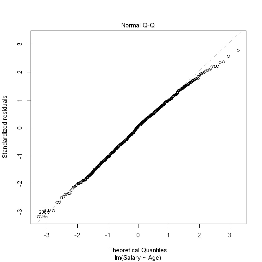
Consistent with the histogram of the residuals, the qq-plot shows that the residuals are approximately normal (i.e., they mostly fall on the straight line).
Warning
Always verify that the model residuals are normally distributed.
