2.3. (§) Visualization with ggplot2¶
Note
This section is optional, and will not be covered in the DSM course.
The tidyverse comes with a popular ecosystem for visualizing data known as ggplot2. In the previous chapter, the section Visualization shows how to create visualizations using only base R functions. These functions generally have straightforward and simple syntax but lack customization, making them difficult to use when creating advanced visualizations. Therefore, many users choose to use ggplot2 to create visualizations in R instead of the base R functions. In this section, we will see how to create all of the visualizations from Visualization with ggplot2.
Visualizations made with ggplot2 begin with the ggplot() function, which is used to specify the variables we want to visualize. Then, additional parameters for the plot are specified using the + operator (see the examples below).
2.3.1. Quantitative variables¶
2.3.1.1. Histogram¶
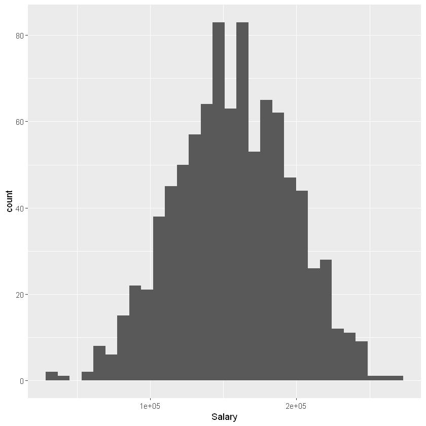
First let’s create a histogram of a single quantitative variable, Salary. Within ggplot() the first argument we specify is the name of the data frame (employees). The second argument is used to set the “aesthetic mappings” of the plot using the aes() function; this essentially describes how the variables in the data set should be mapped onto different properties of the plot. Here we are only working with a single variable (Salary), so within aes() we simply specify x = Salary. We will see more complicated calls to aes() in later examples.
To create a histogram, we combine our call to ggplot() with + geom_histogram():
ggplot(employees, aes(x = Salary)) + geom_histogram()
`stat_bin()` using `bins = 30`. Pick better value with `binwidth`.
2.3.1.2. Boxplot¶
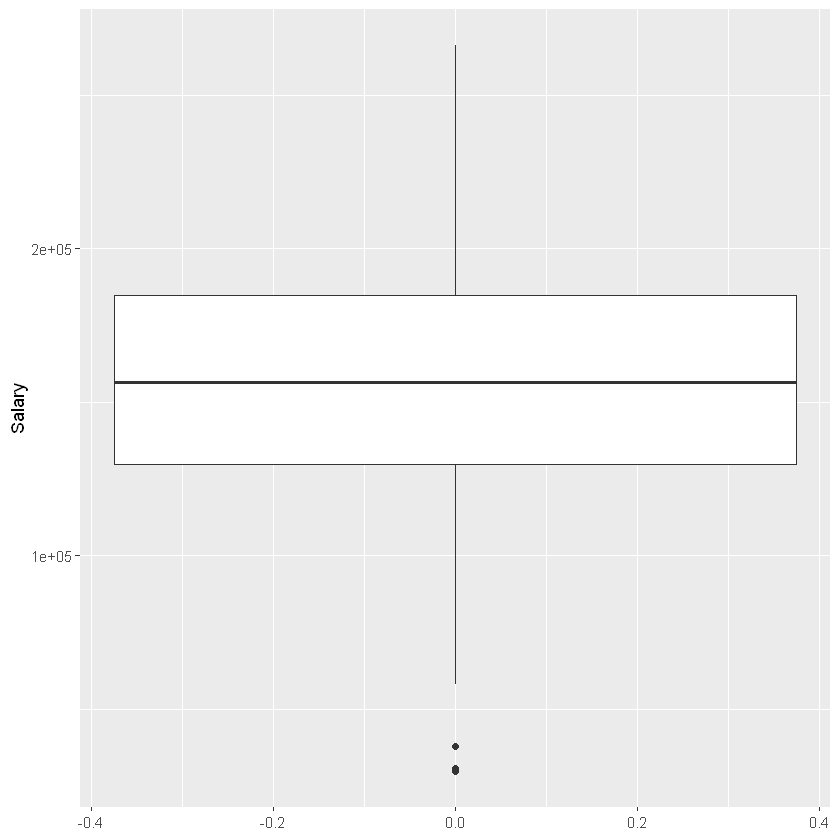
To create a boxplot, we simply change geom_histogram() to geom_boxplot(). Note that unlike the histogram, we are now plotting Salary on the y-axis, so we change the aesthetic mapping from aes(x = Salary) to aes(y = Salary).
ggplot(employees, aes(y = Salary)) + geom_boxplot()
2.3.1.3. Side-by-side boxplot¶
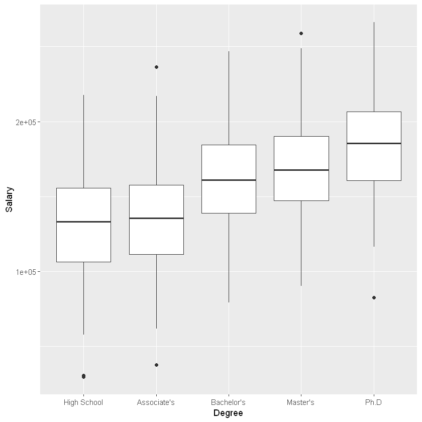
Now imagine we wanted to compare the distribution of a quantitative variable over the values of a categorical variable. For example, we may want to visualize how Salary differs by Degree. To do this, we set y = Salary and x = Degree within our call to aes(), which indicates that Salary should be treated as the y-variable and Degree should be treated as the x-variable:
ggplot(employees, aes(y = Salary, x = Degree)) + geom_boxplot()
2.3.1.4. Scatter plot¶
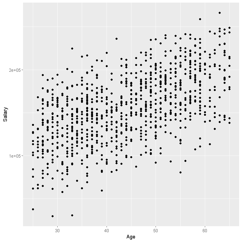
Finally, imagine we wanted to create a scatter plot depicting the relationship between two quantitative variables, Salary and Age. To do this, we set y = Salary and x = Age within our call to aes(), which indicates that Age should be plotted on the x-axis and Salary should be plotted on the y-axis. To create a scatter plot, we then use geom_point():
ggplot(employees, aes(y = Salary, x = Age)) + geom_point()
